Objective
US Bank's corporate credit card program, Access Online, was in need of a full overhaul. Access Online is a legacy system used primarily by Program Administrators who oversee more than 1 million corporate cards for large organizations, (e.g., government agencies, universities, corporate sector, etc.).
Ideally, this system should be a pure productivity application, designed for optimal time-to-task completion. However, the current desktop application is outdated, and unresponsive, with an overwhelming amount of information - much of which is irrelevant to the workflows.
Results
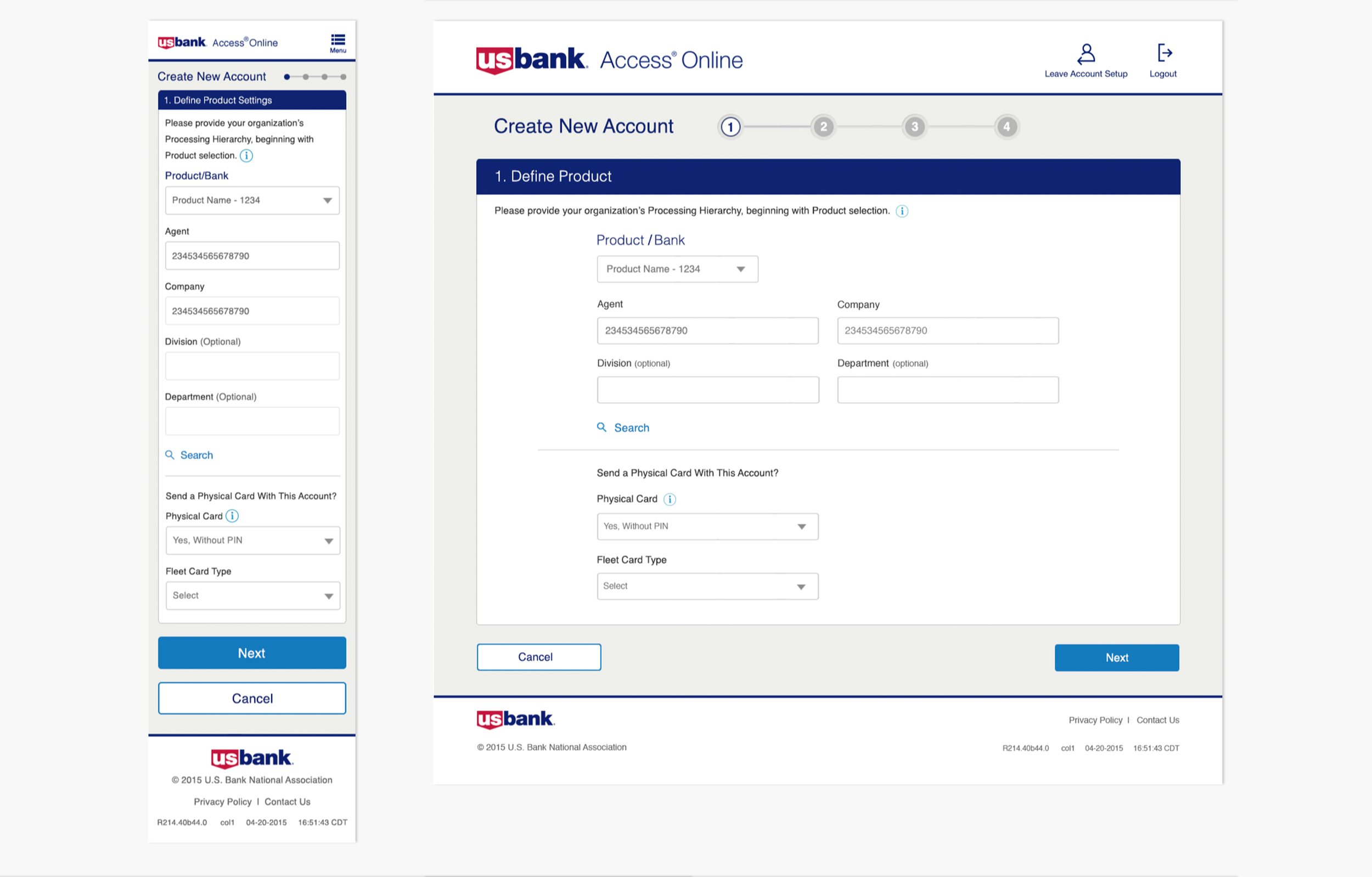
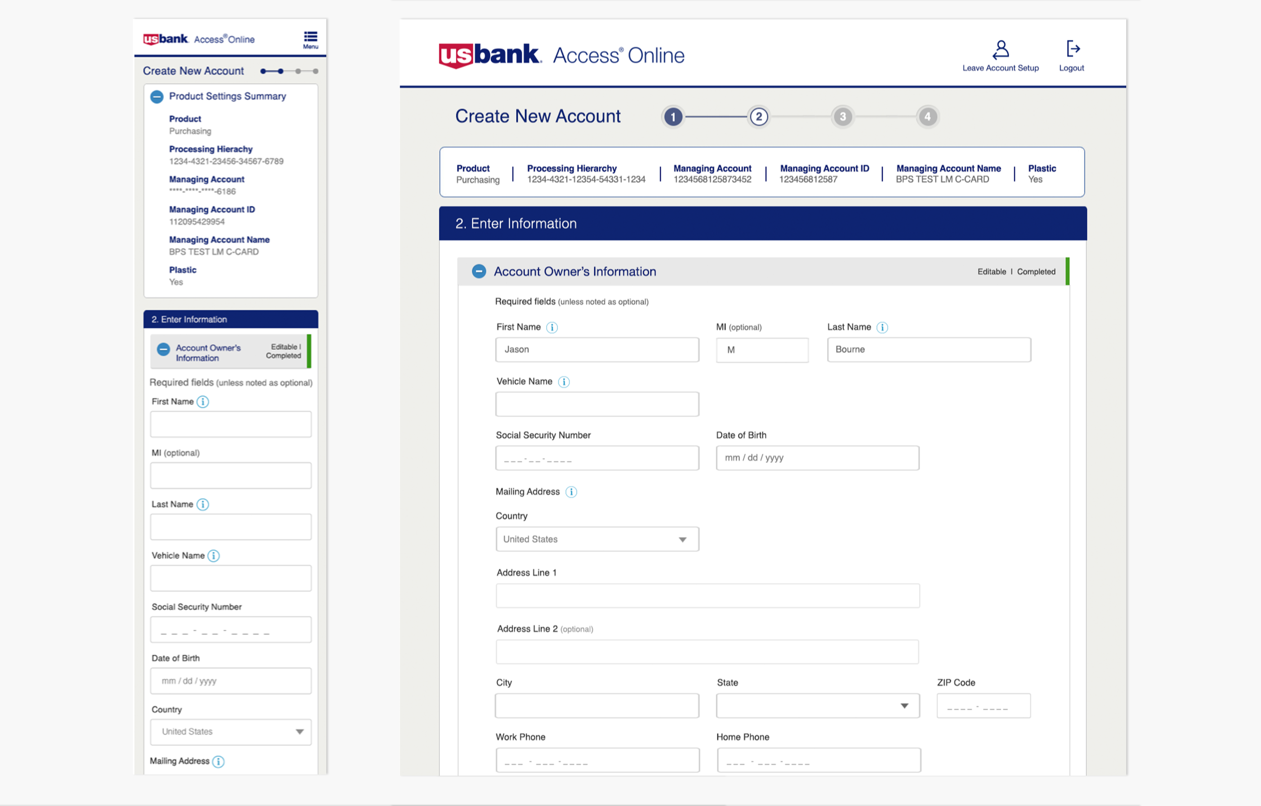
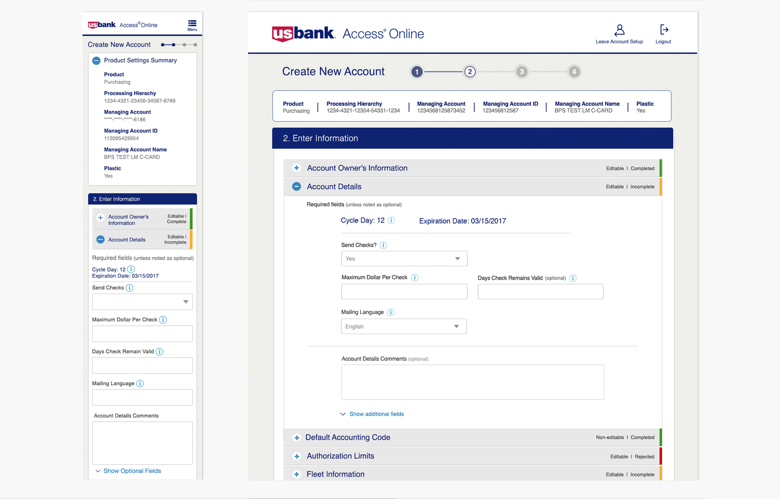
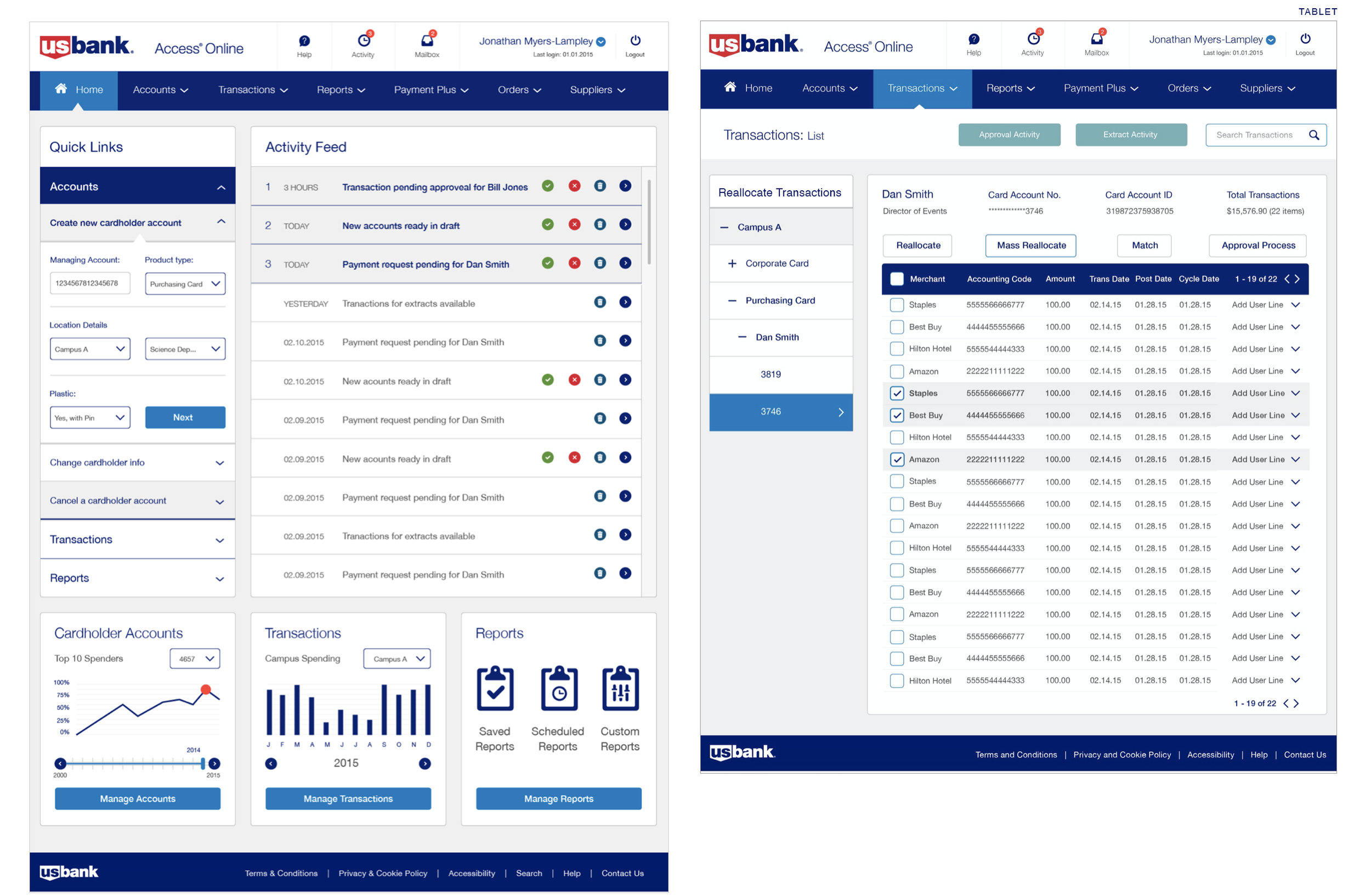
A responsive, intuitive design was developed to create and manage all cardholder accounts, perform complex transactions and generate reports.
A new site architecture, navigation, workflows and visual design was implemented that now allows even the novice to manage thousands of complex transaction on a daily basis.
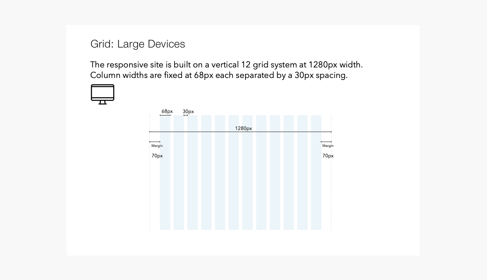
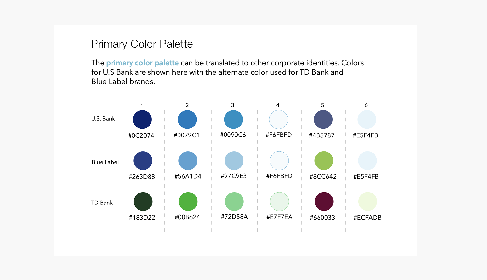
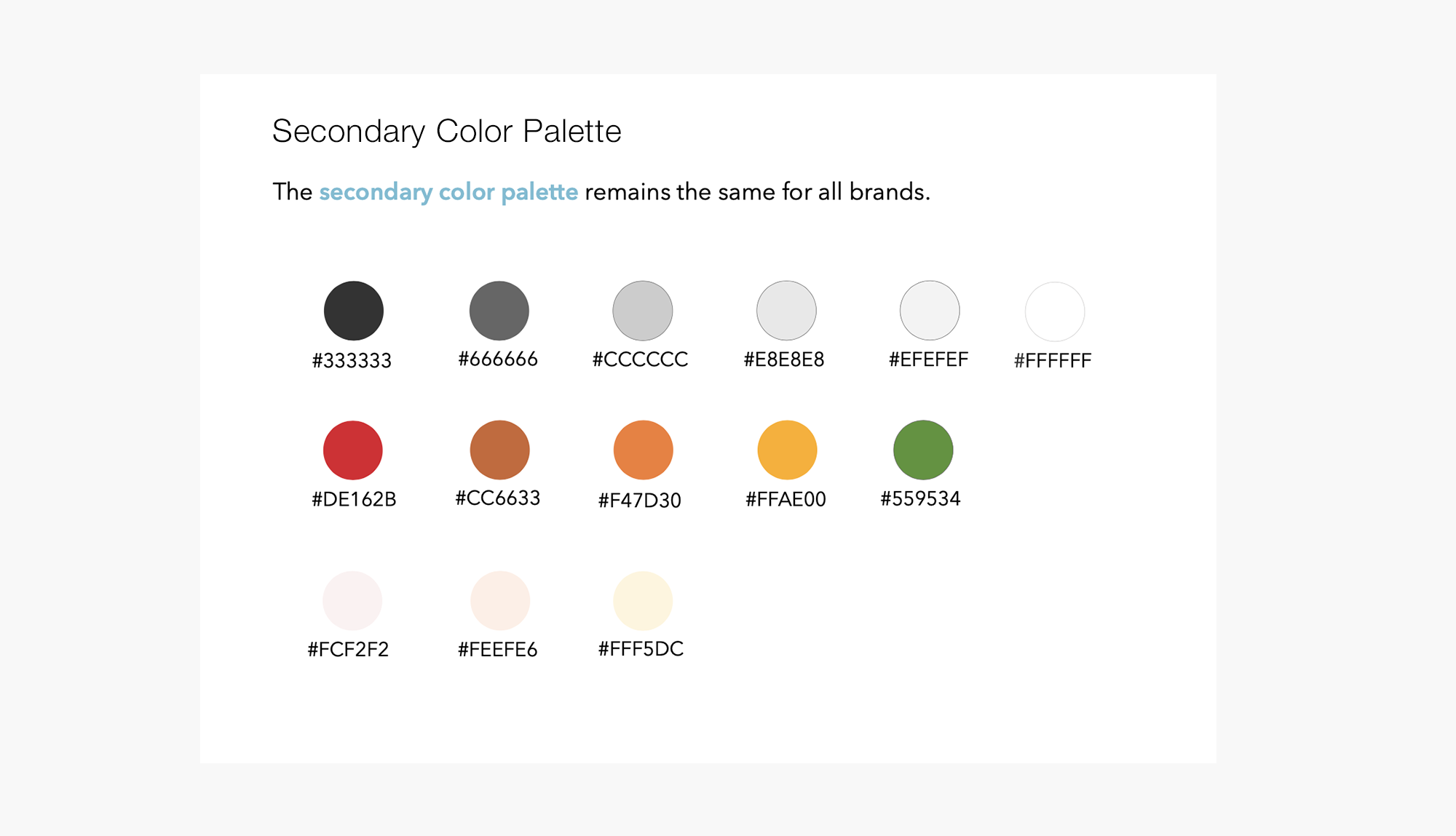
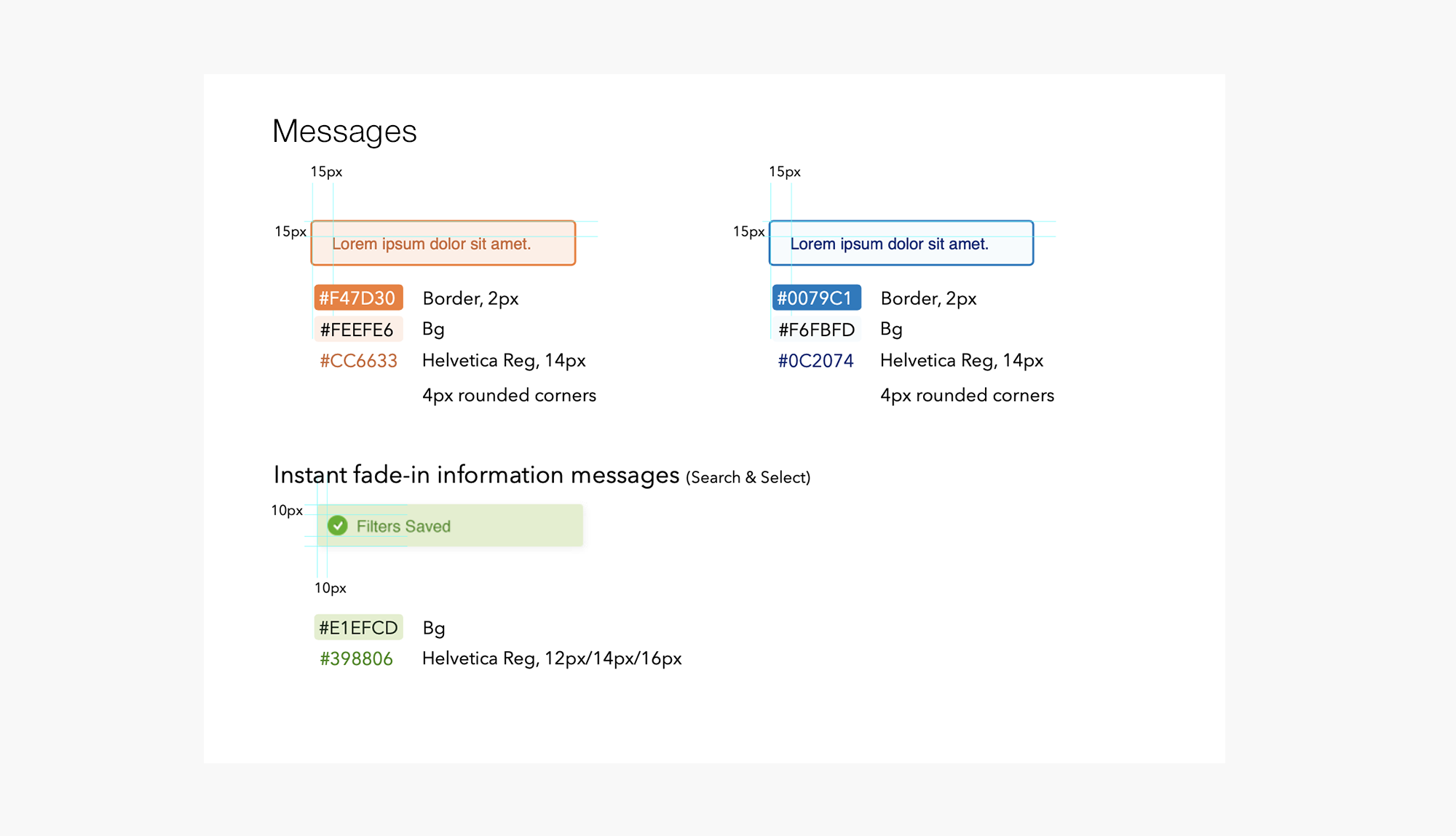
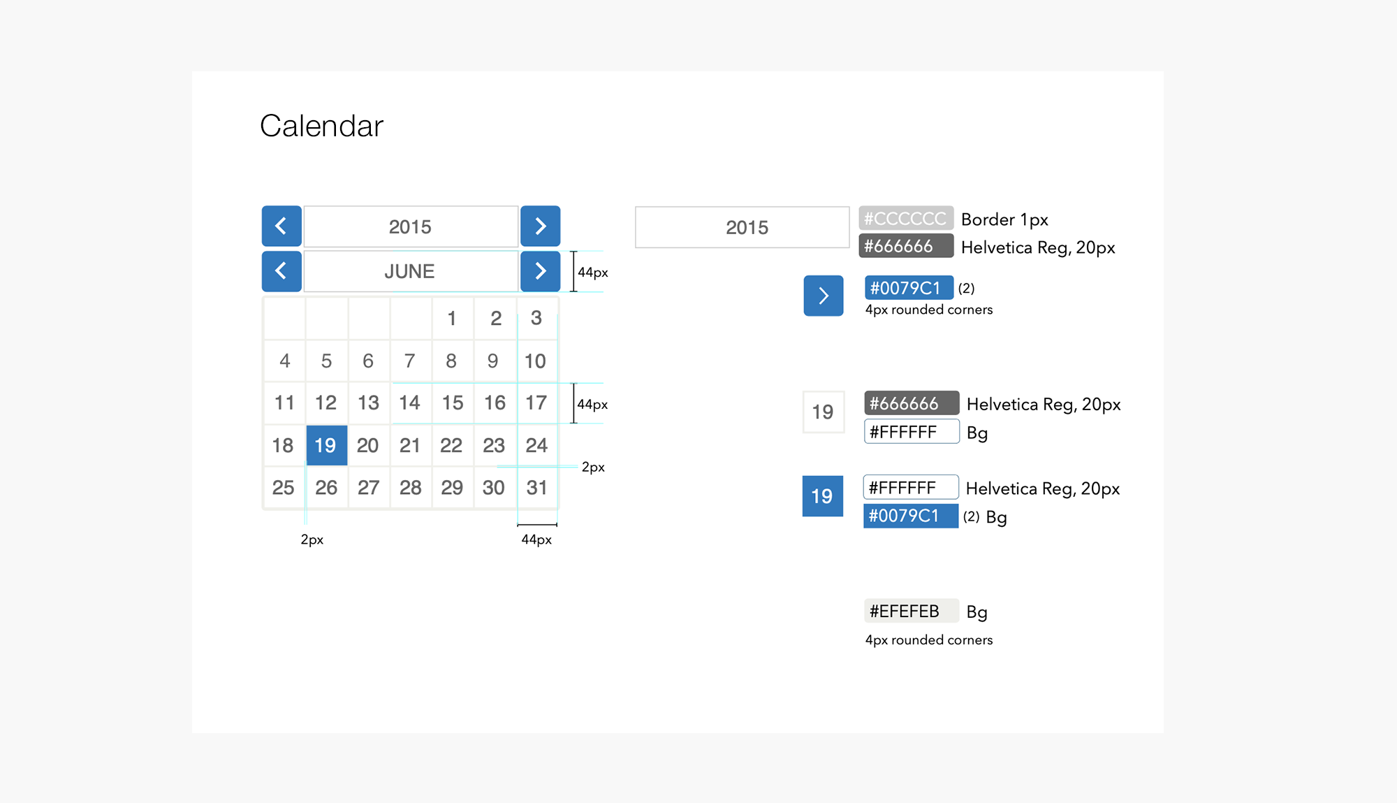
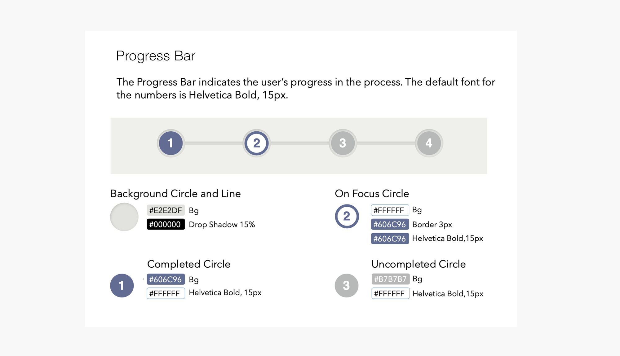
The visual style guide, which enhances the brand identity, was created to provide guidance for future iterations and development.
Application: Access Online
Persona
A core pain point and major area of concern captured from the stakeholder interview sessions was that users spent way too much time completing tasks. The information was so densely packed that it was difficult to determine what was relevant. The application had grown over the years without significant governance in place to regulate or monitor the content. There was a vast amount of information that was outdated, unusable and irrelevant to the task flow.
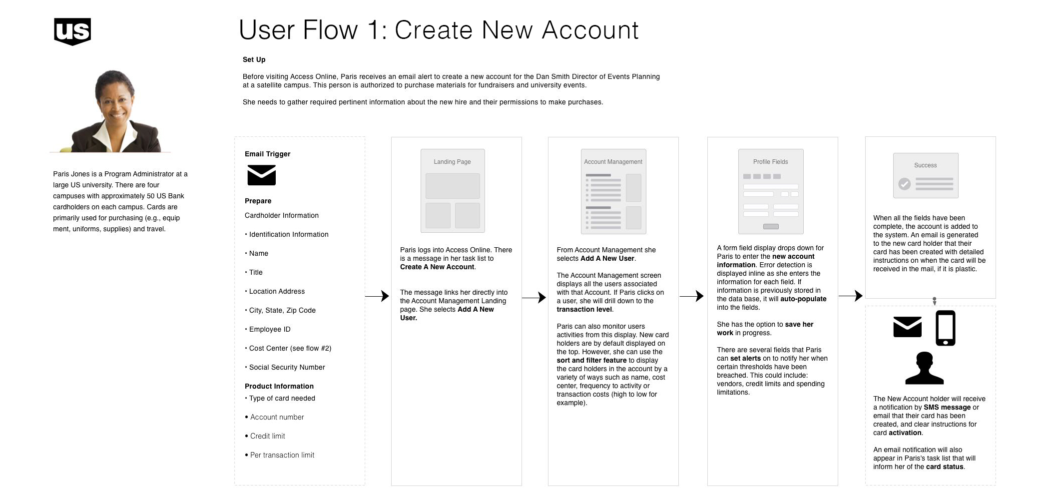
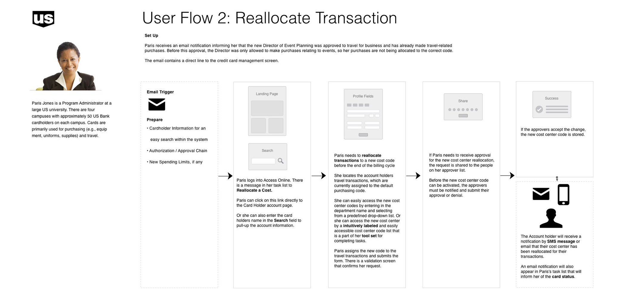
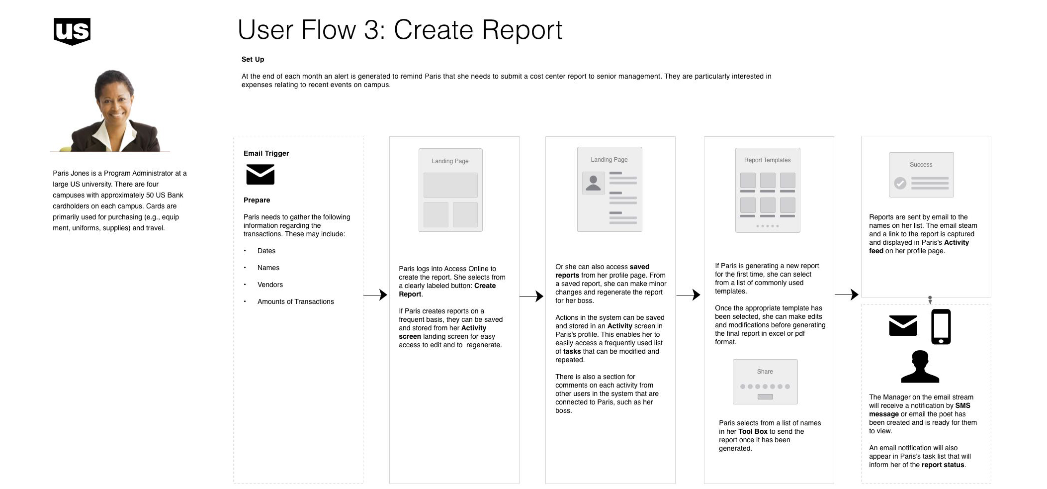
Focus on 3 core workflows
Our approach to the new design was to enable a user to complete specific tasks in the application more easily with a better sense of clarity and direction. Tasks should be compact: quickly and easily completed, resulting in a sense of satisfaction.
Content deemed outside the core task flow will be audited and either removed from the site or rewritten/reworked to reflect the following core work flows:


